
It’s that time again, you know you need to update your website, but you’re really not sure where to start or why it is truly important. Let’s start with our personal, number one reason, new business. Yes, we too want to see that beautiful contact form alerting us regularly to a qualified lead. Luckily, we have a team and the smarts to do just that. Follow us as we walk you through how we turned our own site into a lead-generating machine with the top things to look for when updating your website.
STEP 1: Start with a Website Audit
We like to look at what is happening on the site, as it currently is, so we know where we need to invest and improve upon. Some items we look for are: where users are going and if there are any hurdles through the site structure, any technical errors (i.e. 404 errors, loading issues, etc.), how traffic has trended over the last year and more.
TIP: Review the following during your site audit.
- Clear CTAs (calls-to-action) — do you have them?
- Ease of access to your main pieces of content (ie. services, demos, contact information, etc.)
- Mobile Responsiveness (Google made it mandatory to have a responsive site in 2015)
- SEO (search engine optimization) elements such as unique meta descriptions
- Simplified forms
AN EXAMPLE: The Stone Ward Website
While we were auditing our Stone Ward website for 2019, we came across several things that needed our attention shown below.
Initial On-Page Findings:

Stone Ward’s site was previously not leveraging the “Prime Real Estate” of the site (above-the-fold).
TIP: This area should ideally contain three to five CTA’s within a slider OR two to three static CTA’s in this space. *Recommended CTA’s for us included: “Our Work,” “Our Blog,” “Contact Us.”
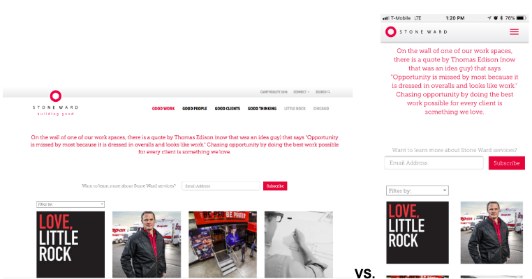
Stone Ward’s “Work” page previously needed better UX design, especially on mobile. Our “Work” imagery was not obvious until you hovered, which is not functional on a mobile device.
TIP: Make sure to walk through your site and click through everything on a mobile device. Some functionalities that look cool on desktop (such as hover information) can actually hurt your experience on mobile.
BONUS TIP: Google now indexes sites in search with a mobile first outlook. (Your mobile experience matters more than your desktop experience in Google’s eyes.)
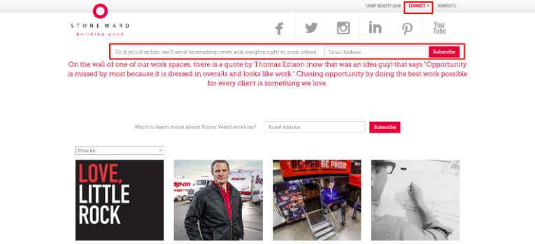
Our menu also previously made it difficult for users to contact us, sign up for our newsletter, or connect with us on social media; some pretty important things for our site to accomplish. In our new design, we made these elements more prominent. We also added a newsletter CTA to all internal pages where applicable.
After running through our audit, we planned a new site structure and wireframed out better UX which leads us to…
STEP 2: Review and Edit Your Sitemap and Structure
After your audit, you should quickly be able to identify what areas need improvement. For us, we landed on reorganizing our menu structure for a more direct user experience and adding our service areas to the site. A rough draft looked like this:
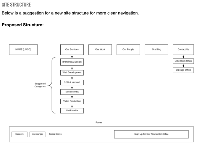
By adding our service areas, we can better showcase our work and create content that can help us show up in search results. Not to mention, we can create some pretty slick newsletter campaigns, paid search campaigns and even social posts around our prime content.
TIP: Make sure your most important content is easily accessible in your main navigation, and no more than three clicks deep.
BONUS TIP: Link to other relevant content within your main pages. For us, we made sure our case studies were in the sidebar of each of our service pages to best showcase that specific service and show proof of what we are able to accomplish for our clients.
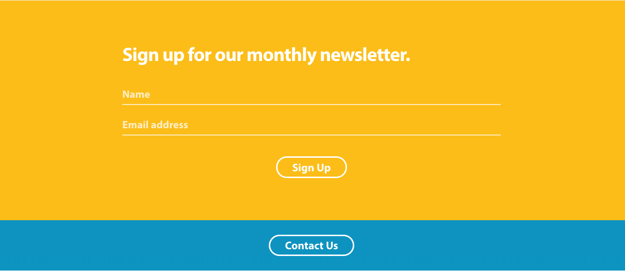
STEP 3: Add Buttons to the Top of Your Site

Just as important as making sure your most important content is displayed front and center, is having prominent CTAs near the top of the page. These should look something like:
- A contact button
- A free demo or white paper download
- An event button
- A newsletter sign up
- A link to the next most relevant piece of content
- A relevant blog post
You get the picture.
TIP: These CTAs should be an actual button and should tell the user exactly what you want them to do. This is not the time to be mysterious or vague. Trust us.
STEP 4: Make Your Forms Simple
If there was ever a place for simplicity, it should be your forms. These are where the magic happens. You want these babies to work well for you, and not deter users from getting in contact with you or purchasing a product/service from your site.
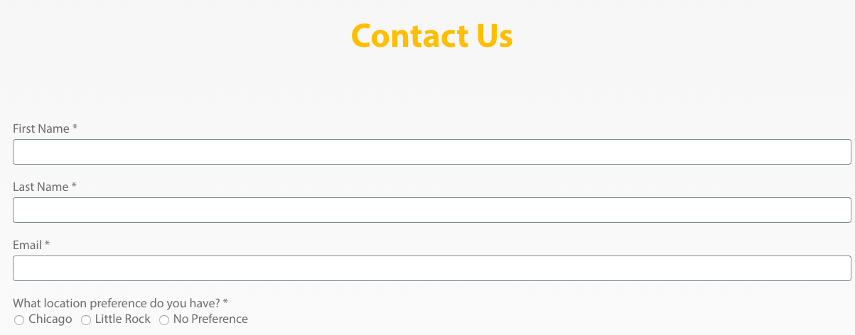
TIP: Ask yourself, “what do I absolutely need from someone?” Also consider using form logic to open up new fields for a more qualified user. And most of all, don’t forget that prominent, bold CTA, the button.

STEP 5: Celebrate!
via GIPHY
Following these best practices will set you up for success. Of course, there is more you can do to help optimize your site for lead generation. If you want to dive deeper, give us a call or fill out our contact form through the nifty button below. — See what we did there?