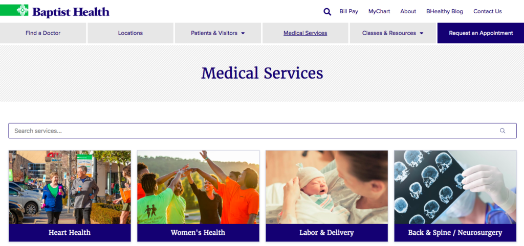
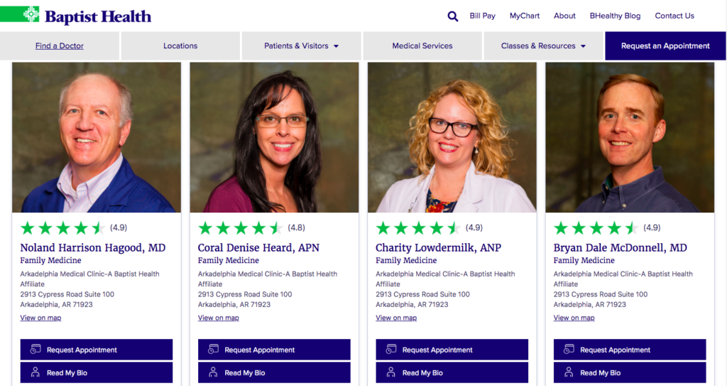
When looking at best practices for designing a health care-centered website, there are not only the basics of a modern website (check out our blog on What to Look for When Updating Your Website) to keep in mind but also some other critical elements. These include items like HIPAA compliance, patient portals, virtual care/telehealth, doctor databases, location management for clinics and hospitals, service lines with related fields, and more.
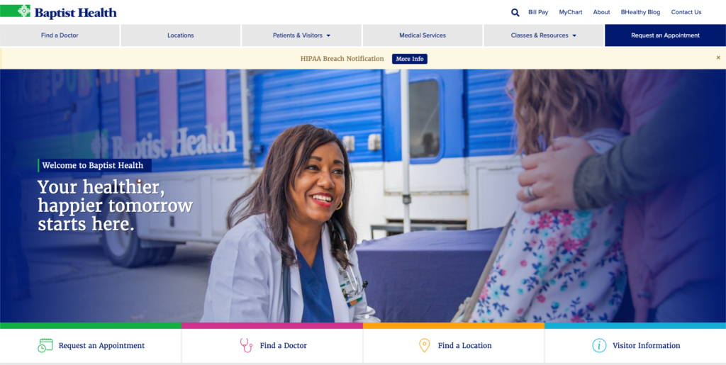
These were some of the key components Baptist Health wanted to address when redesigning its website. When thinking of a new site, Baptist first wanted to stay true to the brand and make sure the new site was patient-centric and followed the continuum of care.
The main goal of the new site was to improve the user experience with easier search capabilities as well as increase appointments for care and classes. With these goals and other objectives in mind, we set out to develop an overarching digital plan that centered around the website.
First Thing’s First, Insights
As with any website, we worked with Baptist to look at other hospital systems’ sites identifying what elements we, as a group, needed to elevate our site to the next level. Using this, as well as running a complete website audit of the old site, we combined the findings along with Baptist Health’s past data, to make informed strategic recommendations.
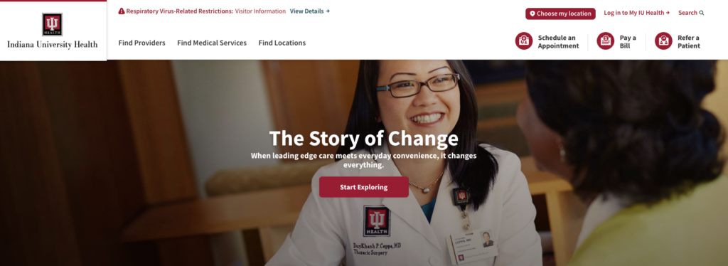
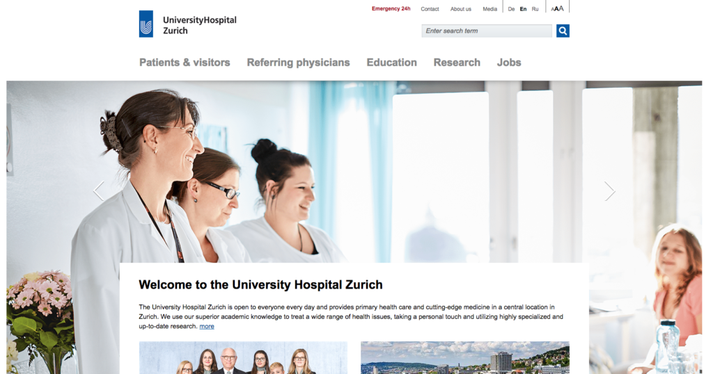
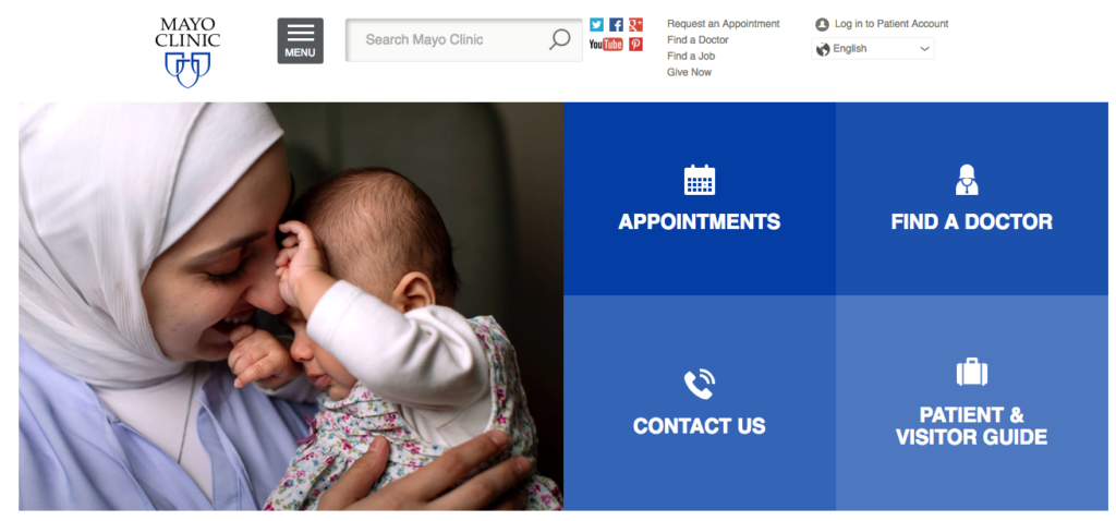
Other hospital website examples included:
Indiana University Health
University Hospital Zurich
Mayo Clinic
A few main takeaways we discovered (and all health care websites should include) were:
- Clear, simple navigation
- Strong calls-to-action (CTAs)
- Approachable, warm imagery
- Inviting and helpful content that is useful for the visitor
- Ease-of-access to find:
- A doctor
- A location
- Patient and visitor information
- The ability to request an appointment
After digging into what made these top-performing health care sites tick, we came up with an overarching goal of a simplified user experience for the entire redesign. Simplification of information was the filter to keep the end-user experience in mind. The team worked with the client to make sure the site represented clear, approachable content that led the visitor to what relevant information they needed while making sure the navigation was easy and clear.
As you can imagine, health care websites can contain a lot of content. The old site contained information that was more of a definition and less about how Baptist Health could keep Arkansans amazing with the care they offer. Making this change in content direction was a must. The team worked collaboratively to edit or rework the content to be more user-friendly and informative, yet concise, which helps user engagement.
Clear Content and Navigation Works
As stated above, one of our main goals was to increase appointment requests. And we kept that top of mind as we simplified the navigation structure and created the site. We made sure that “request an appointment” was prominently featured in multiple locations. In the first six weeks since the new Baptist Health website launched, they have received over one-third of the total number of requests received in 2018 with the old site. Now that’s the kind of result we like to see! Additionally, we also have seen improved user flow throughout the site and better time spent on the site overall.
This analysis will continue each month to make sure we continue to see positive results and gain information to help guide strategic decisions on how to optimize the site as well as the campaigns that drive visitors to the site.
If you would like any help evaluating your website design, feel free to contact us here! Until then, feel free to check out the new Baptist Health website and let us know what you think.