In 2019, data-driven marketing has become more prominent, allowing businesses to form predictions about future behaviors through the use of data analysis. In fact, according to a Forbes survey of 331 executives, “75 percent of companies see an increase in consumer engagement with Data-Driven marketing.”
Analyzing this ever-growing mountain of data has become a tremendous task for marketers to tackle. Those successful at understanding their data are able to develop models and insights that help their business become more efficient. With so much data, however, it’s difficult to know where to begin.
- Would looking at impressions of an ad be better than looking at the bounce rate of a website?
- What time period is relevant to using this data?
- Should we display this data in a table, chart, map or a combination?
Context will dictate where to start, but two of the best ways to improve your ability to analyze findings is by using selective date ranges and understanding when to use tables and charts.
All example data used in this blog is provided by Google Merchandise Store and Google Data Studios demo accounts.

Using Selective Date Ranges and How This Affects Data Quality
The first step to conveying an effective strategy through data-driven marketing is deciding on a date range. Where to start and end data reports can alter interpretations and lead findings down the wrong path. For example, say you want to identify how many visitors came to your website in February as compared to January and March.
Website Visitors by Month
| Month | Website Visitors | Percent Change |
| January | 88,211 | -14.92% |
| February | 85,858 | -2.67% |
| March | 99,698 | 16.12% |
Based on this table, February was the lowest performer for website visitors with 85,858. But why is that? A typical starting place would be to look at the source traffic in Google Analytics. However, it is important to always first consider date range selection when analyzing your data. In this example, February has 3 fewer days in the month when compared to either January or March. Let’s look at what happens when we compare previous periods, measuring exactly the same amount of days within previous months.
| Month | Website Visitors | Percent Change |
| January (1-28) | 78,639 | -19.82% |
| February (1-28) | 85,858 | 9.18% |
| March (1-28) | 91,159 | 6.17% |
With this new date range, we see that February is much closer to March in website visitors and actually outperformed January. In fact, based on the percent increases, February saw a larger increase than March. Though the data are exactly the same in both tables, data can display two significantly different interpretations based on which factors are used to pull and review the data. It is safe to say that data-driven marketing relies heavily on the accuracy of interpretation.
We recommend going through this quick checklist when considering your date ranges:
- Does the difference in the days of the month affect the data significantly?
- What campaigns are running? Make note of any new campaign start dates.
- Does your business have seasonal months? If so, measure them against past years instead of previous months.

Determining When to Use Tables and Charts
Tables or charts? An age-old question that goes back and forth consistently. Do you use granular tables that give too much information or charts that may not give enough? The answer is to use a combination when visualizing your data.
Charts are superior at gaining a bird’s-eye view of your marketing campaign performance. These are great for conveying performance comparisons in presentations and should be used frequently. In the chart below, we see that on Feb. 7 there is a sudden spike in the clicks and impressions, followed by a stabilization of the data. This could easily convey a change in the campaign strategy or new copy that resulted in higher performance for the last week. Thanks to the timeline the chart provides, we can easily see these changes.
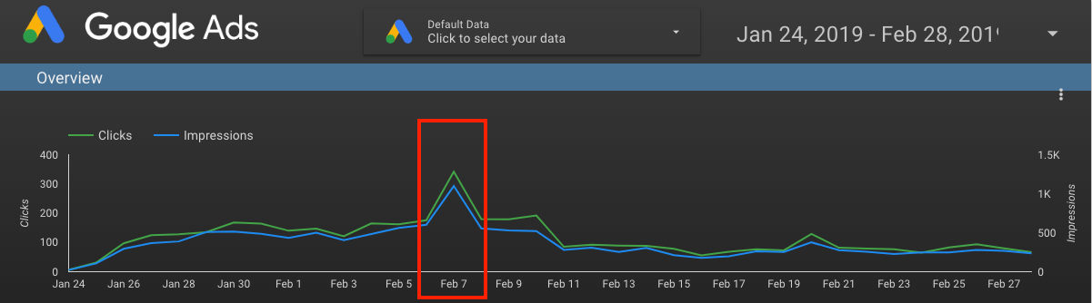
However, the chart does not answer which particular campaign was successful. Granular, focused data visualization, such as tables, is a fantastic tool for capturing the exact performance once you know what you’re looking for. See the table below for the performance of the campaigns after the spike.
February 7 – February 13 2019
| Campaign Name | Impressions | Percent Increase | Clicks | Percent Increase |
| A | 1,461 | 52.3% | 513 | 57.8% |
| B | 1,190 | -35.7% | 405 | -30.7% |
| C | 331 | 76.1% | 119 | 83.1% |
From the table above, we see that campaigns A and C had significant increases in performance while campaign B had a decrease in performance. By using a chart opposed to a graph, we’re able to quickly identify that we need to review the differences between these campaigns to identify the source of the problem.
Say, for instance, campaign B had old copy while other campaigns had new copy. We could logically reason that new copy added significant campaign performance and impacted data metrics, as shown in the table. Taking the steps to combine our use of these charts help us uncover and easily convey the answer to the problem. Remember that charts will help you identify larger trends while tables help identity granular data trends.
Through selective date-ranges and understanding when to use tables and charts, we are able to improve our ability to analyze data on a trend and granular level. However, it is just as important to be able to share your findings in a detailed, yet understandable, manner. A pie chart will not be the best for telling you the past performance of a campaign, nor will a histogram help you easily find outliers in your data. If you want to learn more or have the experts do it for you, fill out our contact form here.