| CASE STUDY

Ozark United FC

United in Spirit, Built on Community: How Stone Ward Launched Ozark United FC, The First Professional Soccer Team in Arkansas

From a name and crest to a thriving fan base, Stone Ward helped transform a vision into a brand that unites Northwest Arkansas.

Ozark United FC logo

Challenge

Build a professional soccer club from the ground up, with a foundation rooted in community and driven by a vision of purpose.

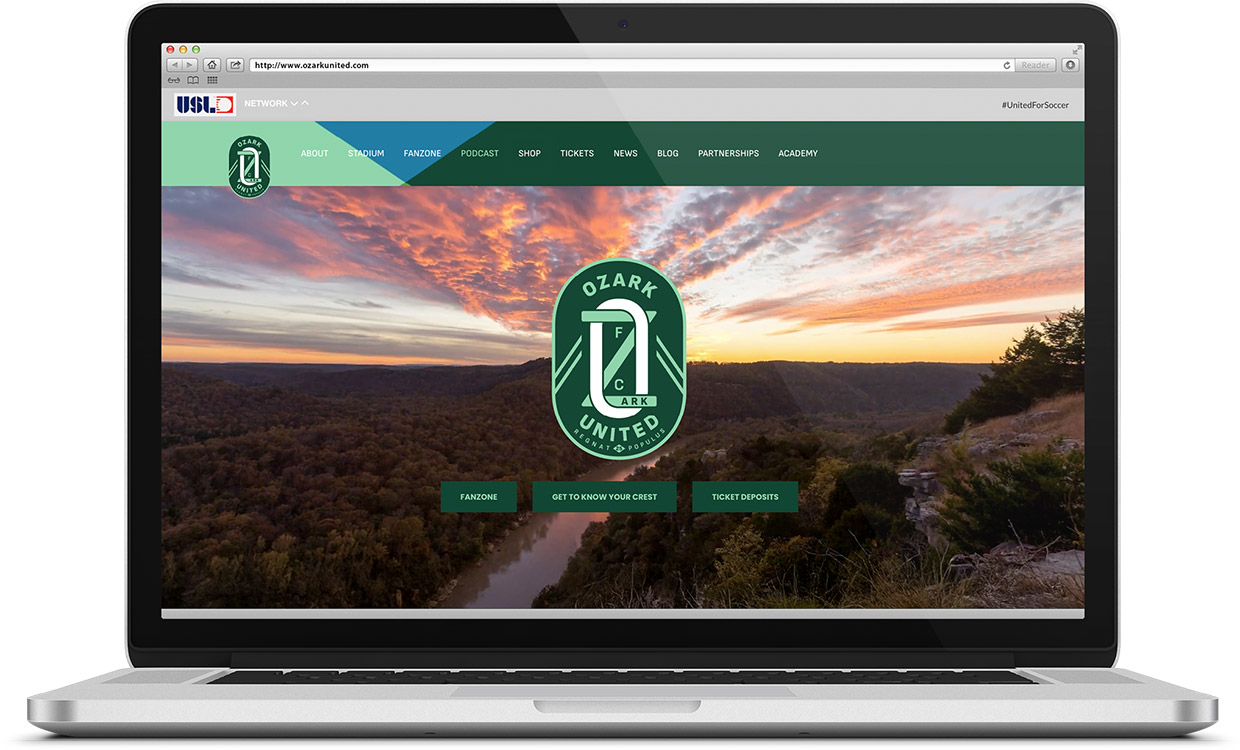
When Ozark United’s co-founders set out to bring professional soccer to Northwest Arkansas, they had no name, no crest, and no mission, only a bold vision and a deep belief in the region’s potential. The challenge wasn’t just to create a brand; it was to ensure every element of the club was authentically shaped by the community it sought to unite. From the name to the crest and beyond, this meant crafting something tangible, emotional, and enduring - built entirely on the voices of the region.

Approach

Turning vision into reality, one community voice at a time.

To build a club truly rooted in the community, Stone Ward prioritized deep engagement and collaboration at every stage of the process.

  • Listening First: Gathering over 2,000 name suggestions and involving diverse voices, including Spanish and Marshallese speakers, to ensure inclusivity and accessibility in every decision.
  • Collaborative Design: Partnering with 36 founding fans and engaging the entire region through online feedback, quizzes, and polls to refine every aspect of the brand, from the name to the crest to the color.
  • Creating a Symbol of Unity: Designing a crest and selecting colors that represent the Ozarks' natural beauty while celebrating the diversity and collective spirit of the region.
  • A Celebration of Unity: Hosting a launch event that brought the community together to unveil the name, crest, and vision, creating a powerful moment of pride and belonging for fans and stakeholders alike.
Ozark United FC Story
Ozark United FC Billboard

Results

A club with a purpose, a brand with a community at its heart.

  • A Name That Resonates: Ozark United FC emerged as the clear choice, representing unity, regional pride, and the collective spirit of Northwest Arkansas. More than 90% of the founding fan panel supported the final name, which was also reinforced by input from thousands of community members through online feedback.
  • A Crest That Inspires: The green-and-white crest, designed with local input, symbolizes the natural beauty of the Ozarks and the shared values of diversity and connection.
  • An Engaged and Loyal Fanbase: From 2,000 name submissions to the celebration-filled launch event, the club earned the emotional investment of thousands of local residents, creating a passionate base of supporters ready to rally behind the team.
  • A Movement in Motion: The men’s team branding laid the groundwork for future expansion, including the upcoming women’s team, ensuring the club continues to grow as a unifying force for the region.
  • A Moment of Unity: The launch event brought the vision to life, giving the community a shared moment of pride, excitement, and celebration - a tangible reminder of what they built together.
Ozark United FC Website
Ozark United FC Merch

Our work with Ozark United FC on this project included the following services:

  • Strategy
  • Brand
  • Creative