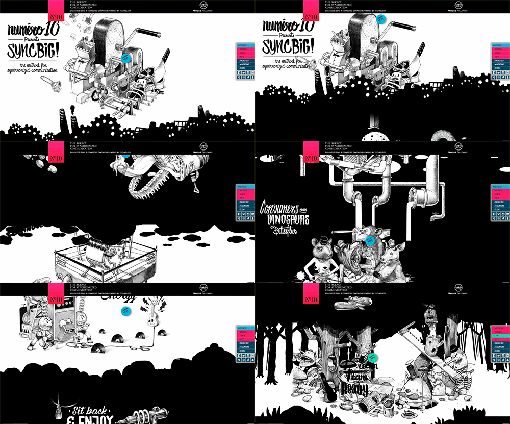
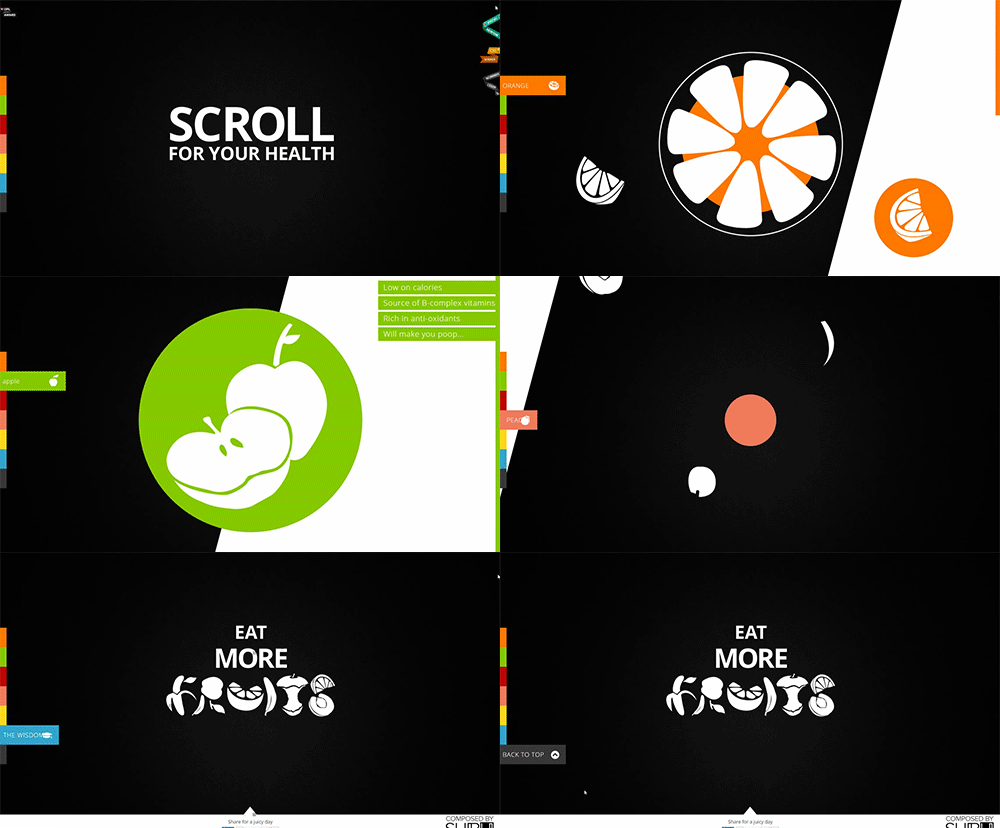
In the last couple of years, parallax scrolling emerged from the shadows, and took over the world wide web. Parallax scrolling allows the background to move with a different speed than the foreground. This visual effect originated from 2D side scrolling video games, where it conveyed a false sense of depth and momentum, as the character journeyed across the scene.
Today, it seems that parallax is used everywhere. I get it. Parallax is new and shiny, and all of the cool kids are doing it. Parallax, when used correctly, can be a very powerful branding tool. However, don’t rush into it. Parallax could also hurt your brand and negate your message, if used incorrectly.
Don’t sweat it! Just follow these rules during your design process, and your site will really pack a punch!
Always Put Content First
We’ve all been there. A site loads. Everything moves. Text fades. We scroll halfway through the site, and… “Why did we come here again? What were we looking for?” While it looks fantastic, too much parallax can cloud up your site’s message, and make it difficult to search for important information.
Here’s an easy fix:
- Decide which content will be sought after the most (event information, contact information, product information, etc.), and limit visual effects in that area. You could also provide an easily found jump menu that brings the user directly to that information.
- Don’t set animations for long, important text. Users come in all sizes, reading abilities, and attention spans. Your message could disappear before it’s received. If this content must be animated, try breaking it up into smaller, easily digestible pieces.
- If the site is one page, limit its length. A large, one-page site will have a heavy initial download, and may take a long time to load. The majority of users will leave a site after a few seconds of loading time.
- If you have too much content, break it up into different pages. By doing this, you could go all out on your homepage, while highlighting teasers to the inner pages. The loading time will dramatically decrease, and you don’t have to sacrifice any content.
Know Your Audience
Parallax can have a helping hand in all websites. However, exercise restraint for more serious, informational websites (law firms, doctors, government, universities). Let’s face it: unless they are Saul Goodman, a flying gavel on a law firm’s website will look unprofessional. Depending on the structure of the site, limiting the parallax to just the background of a couple of sections could still produce a modern, yet professional site. Minimal parallax on informational websites will also allow users to find content easily, and allow more room for important information. (I know you didn’t forget about the first rule already!)
Heavier levels of parallax work best with promotional sites (events, movies, campaigns, etc.), and image heavy sites. The sole purpose of these websites are to grab their audience’s attention, and say “HEY! Look at me! Look at what I have to offer.” These websites typically contain very little textual information, but provide a visual stimulus to sell their message.
Another BIG factor, when considering parallax is your audience’s age. Unless your grandma is really hip, parallax could be overwhelming for her. If your audience skews older, limit your site’s animations and make it easy to navigate.
Plan for Mobile
Today, more than half of internet access is from a mobile device. Even Google jumped on board when they launched their notorious Mobilgeddon, which discriminates against mobile unfriendly sites in search results on a mobile device.
Parallax will work on tablets, but it is not smartphone compatible. When designing your site, ensure that the basic layout can be easily translated to mobile. Watch for sections overlapping, or overflowing. Look for backgrounds that may conflict with text legibility. Only keep the necessary content on your mobile site. Do you really need that second dancing cat? Unless they are connected to wifi, mobile users will be using their data to view your site. Feel honored, and return the favor. Limiting content will allow the site to load faster, and use less of the user’s data.
While it can be tempting to grab the newest visual effect, it could make or break your site. Before you get started on your next website design, ask yourself and your team these questions:
- What is our message?
- Who is our audience?
- Which information is the most important?
- How will this look on a mobile device?


