Why prototype? Traditional web design techniques can be used for mobile development. Wireframes are still valuable tools for allocating screen real estate and quickly playing with workflow in the initial conception phase.
But once you get down to making your app look and feel the way it will on delivery, desktop tools and traditional techniques like design comps fall short. Text that looks fine on a desktop monitor comes out tiny and unreadable on a mobile screen. Familiar form widgets and controls like select boxes and text entry work different on mobile. Different screen orientations and different device types make controls work differently.
Thinking about design in a responsive way is a good first step, and addresses overall page layout concerns. But, it’s still really easy to design text that’s too small and buttons that are too tiny to touch if you’re using Photoshop to draw up a comp. It’s also easy to overlook device quirks like pop-up touch keyboards taking up screen space and other mobile specific problems.
Using a mobile friendly toolkit is a good next step. jQuery mobile will save you a lot of hassle troubleshooting input interactions and getting touch navigation right. It comes with a set of styles that work well and are tested on it’s list of supported devices.
But you still won’t have a good representation if what your app or site will look like in your hand on your device until you have a site to go to and play with. That’s where prototyping tools come in. Developing a prototype you can view on your actual mobile devices lets you test early and test often. It lets you put usability first, let technical implementation and design follow.
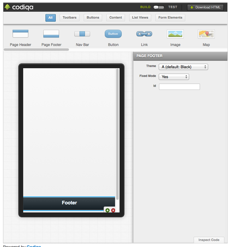
Codiqua is a leader in the mobile prototyping space. You can try it for free on the jQuery Mobile home page http://jquerymobile.com/. Other simliar tools are Mobjectify and Tiggzi.
The process is simple. Use the tool to drag and drop your controls into place, preview on your desktop, download the HTML and put it on a server where you can access it on the web, then load it up on your phone and tablet and see how it works there.
Of course any back end functionality will still need to be developed, and you will still need to code any event handling scripting your app will need. But having the elements on screen and being able to try actions out will help you make a better interface and support more devices. Getting to that point with prototyping as quickly and inexpensively as possible will lead to better sites and less time spent troubleshooting in the long run.


