The National Women’s Soccer League (NWSL) announced a new media and broadcast partnership with A+E Network and Lifetime to kick off its fifth season. This created the perfect opportunity for the Stone Ward Chicago team to help rebrand the NWSL Championship. Building an identity for the annual pinnacle event was important to celebrate the strength of the league and the women who play in it for years to come.
To create the new Championship logo, we combined elements from the NWSL brand identity and the Championship trophy itself. The redesigned logo features the master brand typeface, a stylized depiction of the trophy, and ten stars representing each NWSL team in pursuit of the league’s ultimate prize.
![]()
The elite gold, silver, black and white color palette, combined with a dramatic photo treatment, distinctively elevated the postseason look from the NWSL red, white and navy used during regular season.
Once the Championship look was complete, the real fun began for the agency. From digital content, media backdrops, uniform patches and medals to in-stadium environment graphics and branding within the city of Orlando itself, Stone Ward touched a variety projects to ensure the bold, golden look for the 2017 Championship would be everywhere. For fans that weren’t lucky enough to be in sunny Florida, our design team made pre-game, in-game and post-game creative content to keep up with all of the action.
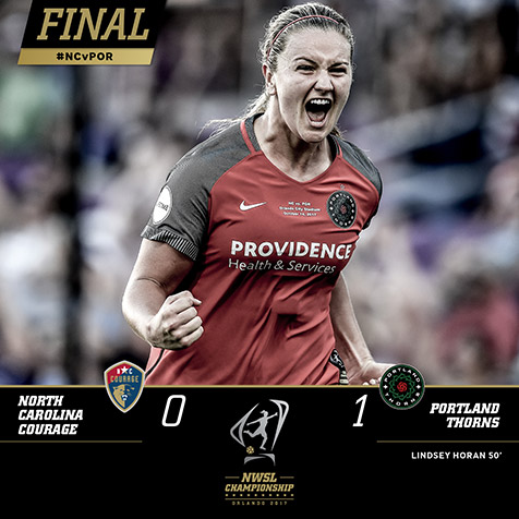
Congratulations to the Portland Thorns on taking the crown as 2017 NWSL Champions – the Stone Ward team can’t wait for next season!