This June, the world again will erupt in World Cup frenzy. And we decided to channel our own pre-tournament buzz into something productive, like making infographics.
The first step in rendering a dataset into something visually understandable is to figure out the story you want to tell. Data is endlessly streaming into our lives, but a good infographic tells a story, and uses the data to help the viewer understand trends or scale. Without a good narrative, even the most attractive visualization won’t fulfill the primary objective: communication.
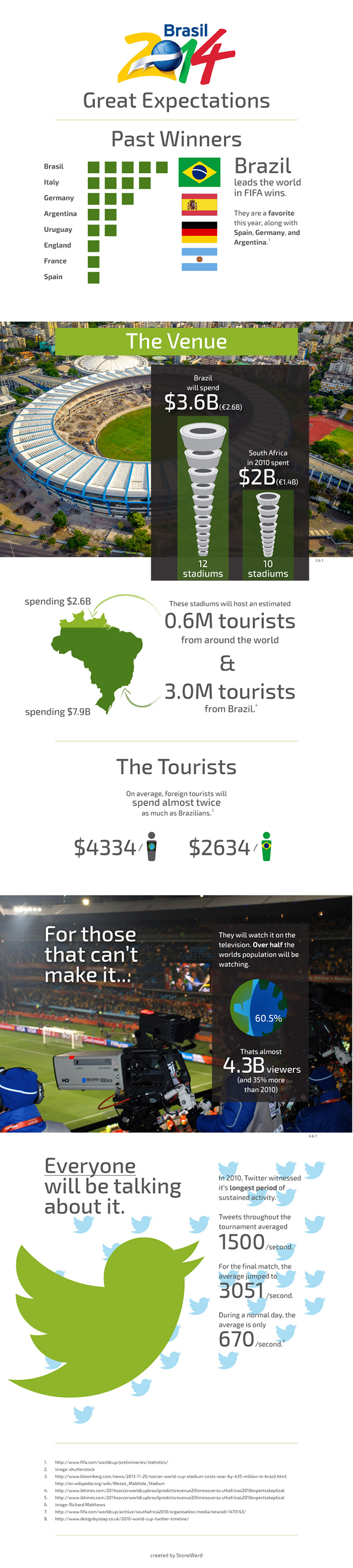
Based on our exploratory research, we found several statistics that seemed to indicate that the scale of 2014’s tournament in Brazil is expected to exceed (by far) the scale of 2010’s tournament in South Africa, in terms of money, tourism, tv viewers and social media activity. So with this hypothesis in mind, we sought out more stats to see if we could strengthen our case. This turned out to be very easy to do, and it led to a title we thought was appropriate: “Great Expectations: World Cup 2014.”
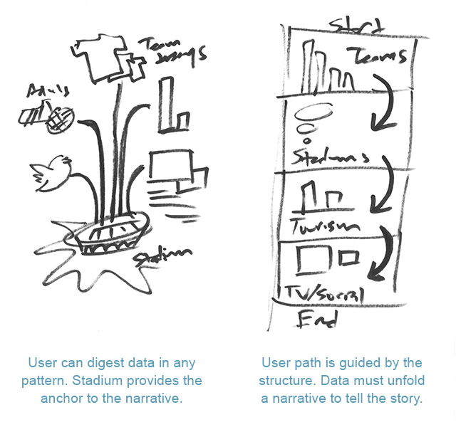
The next step was to organize our data into a visual flow. Does the story lend itself to a graphic that moves upward or outward? Linear or scattered? Is there a single focal point or multiple? Even within a well-defined story, the visual can be rendered in several different ways. The sketches above show the two ways we pursued. The finished graphics are below. Go USA!
Infographic 1
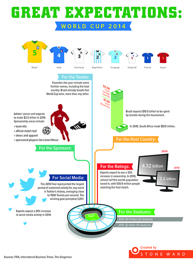
Infographic 2