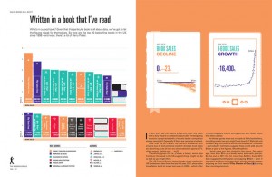
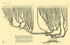
Well, it may not be the entire history but there are some pretty interesting things in this new book. Imagine, if you will, an infographic on the composition of the human body or a timeline on the history of visual arts or a cool poster-like graphic on the global wage gap between sexes.
The book’s editor, Craig Adams, did an interview with Co.create about how the book came together with Co.create writer, Joe Berkowitz. In his article, Berkowitz defines infographics as the “intersection of data, design and storytelling.” The difference in this book and others is that most of the time infographics are used to illustrate disparate concepts, says Berkowitz. “Much more rarely are they grouped in themes to serve a larger narrative.”
“The Infographic History of the World” is a 200 -page book that attempts to chronicle nearly 14 billion years of earth’s history, all rendered in topic-specific graphics relevant to the content.
Craig Adams, the editor of “The Infographic History of the World” says his idea was to find an author and designer he could pair up to tell the story that would result in a “quick, easy-to-read and novel way to approach an old subject.” Yes, think of those heavy, thick world history books you had in college. This would be pretty cool, instead.
Personally, I love infographics because they help us visualize facts or data that are often hard-to-understand or remember. A picture really is worth a thousand words.
Check out this link to Co.create and preview the book. I’ll bet the information junkies of the world will be compelled to order it. I was.


