The next picture you take with your digital camera, pay attention to the “click” sound it makes. It was an indication that a picture has been taken, but your camera doesn’t have a traditional shutter, so why did the camera manufacturer make it sound like one?
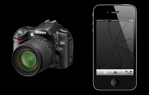
Photo credit: http://blog.hyperquake.com/
It’s a skeuomorph, of course! It may sound like an alien race, but it’s actually defined as a derivative object that retains ornamental design cues to a structure that was necessary in the original. Ouch, let’s try that in layman’s terms: it’s something new and different that retains the appearance of something you already are familiar with. Like a chandelier light bulb shaped like a flame. Or artificial film grain added to a digitally-shot movie.
It’s a fun exercise to think of as many of these as you can, but this is my post after all, so I’m going to narrow the field a bit to the User Interface design (UI) of the screens you see every day; your phone, your desktop, your tablet, your tv. Why does the trash can icon on my Mac look like a trash can? Why do files and folders look like….you guessed it…files and folders?
Proponents of skeuomorphic UI design describe the benefits this way:
- Instant familiarity: A user might be more likely to adopt a new app or a new device if it retains the appearance or method of interaction they are used to, a way to bridge the old and the new.
- Usability: When it comes to UI, the greatest sin is making things unclear. User have to know how to make their way around and how to take action steps. Buttons, switches and sliders all make it clear that an action takes place here.
- It just looks good: Architects have been using skeuomorphic principles for centuries. Sometimes the best building material does not make for the most appealing space, that’s why you see columns that don’t support anything and why some aluminum siding has wood grain molded into its surface.
Detractors outline the pitfalls like this:
- False promises: A skeuomorph must function exactly like its real-world counterpart, or the user will become frustrated. This is not always possible when the methods of user-input vary from a mouse-click to the touch of a finger.
- Clutter: It takes up visual space and compromises the speed and battery life of your device.
- It slows innovation: Our interactions online are evolving constantly, are we limiting progress by holding on to the past?
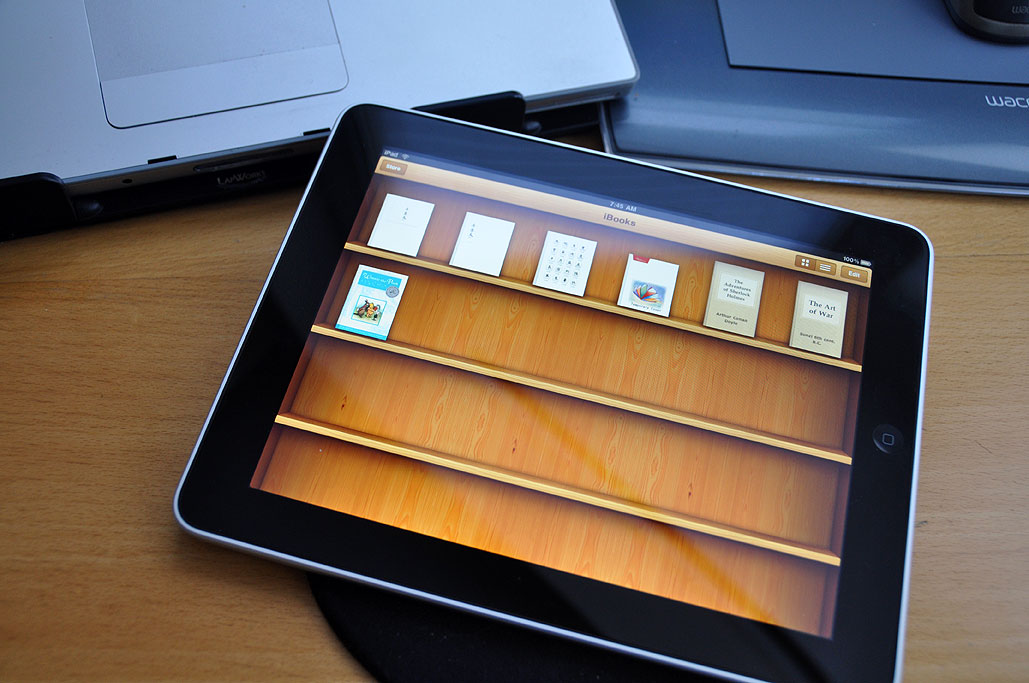
Photo credit: Rainy Day Entertainment© 2010
Ironically, Apple has been at the forefront of skeuomorphic design for years, especially when it launched the Aqua visual theme in 2000, which introduced us to glossy, curved shapes and beautifully rendered icons. I say “ironically,” because Apple’s approach to product design leans toward simple, functionality-driven shapes. Android’s app development guidelines read similarly:
“Real objects are more fun than buttons and menus because they allow people to directly touch and manipulate objects in your app. It reduces the cognitive effort needed to perform a task while making it more emotionally satisfying.”
Microsoft, however, is going full-throttle in the opposite direction with their innovative interfaces for the Windows Phone and new Windows 8 operating systems. Their Metro design language, based on principles of Swiss graphic design, relies primarily on color and typography to guide the user experience. It’s all about content, they say. It’s been validated by awards, but it remains to be seen whether users who seem to enjoy the mobile experience will adopt it across platforms.

Photo credit: Customize.org
If you’ve read this far (hey, thanks!), you might be expecting me to take a position for or against the use of skeuomorphs, but I won’t. Many of us in the (ever-expanding) universe of content-creation for digital devices feel a responsibility to help craft next-generation methods and practices for user interaction, and it is important, but it must be viewed through two lenses simultaneously: user interaction (did I find what I was looking for?) and user experience (was it easy/fun/moving/entertaining?). The nature of those who make products and operating systems (mass produced) means each of those brands has to define the UI that makes the most sense to them, and stick with it. The nature of communications is different, we are able to be more flexible, target narrower audience segments and use all the tools we have (including UI) to make our message as appropriate and compelling as we can.
So that means sometimes we skeu this way, sometimes we skeu the other way. And if it doesn’t work, we drag it to our trash-can icon where it makes that cool, crinkly-paper sound.